
Still poking through the Isle of Armor… when I’m done, I’ll post a review.
The Actual News:
Alright so, after catching some more Pokémon in Pokémon GO, I restarted my data collection to see if my original IV data was skewed to show a greater bias towards higher IVs, or if the in-game IV randomizer was what was doing it.
As a reminder, I noticed that in Pokémon GO, the IVs that each newly caught Pokémon are generated with skew towards better values, which shouldn’t be the case if Pokémon were generated with completely randomized IVs. However, I was unsure if it was because I had transferred lower quality Pokémon before recording their IV data and thus the only data I had were for Pokémon with good stats, or if it was because the game itself generated those skewed values.
- (If you need more info about what I’m talking about, check out the Pokémon GO page.)
So what I did was restart my data collection from scratch, as well as recorded the data for EVERY Pokémon I caught; this was because the game does generated Pokémon with great stats in the case of Pokémon hatched from eggs, or as a reward for performing Professor tasks, Pokémon which came from a raid, etc. So by focusing solely on caught Pokémon, which ideally would have completely randomized stats, this would therefore reveal unskewed data…. right?
Well, you be the judge:
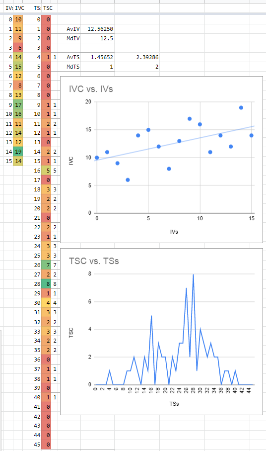
So for your information, the top chart is a histogram of all the individual IV values, while the bottom graph is a histogram of the summations of each Pokémon’s IVs.
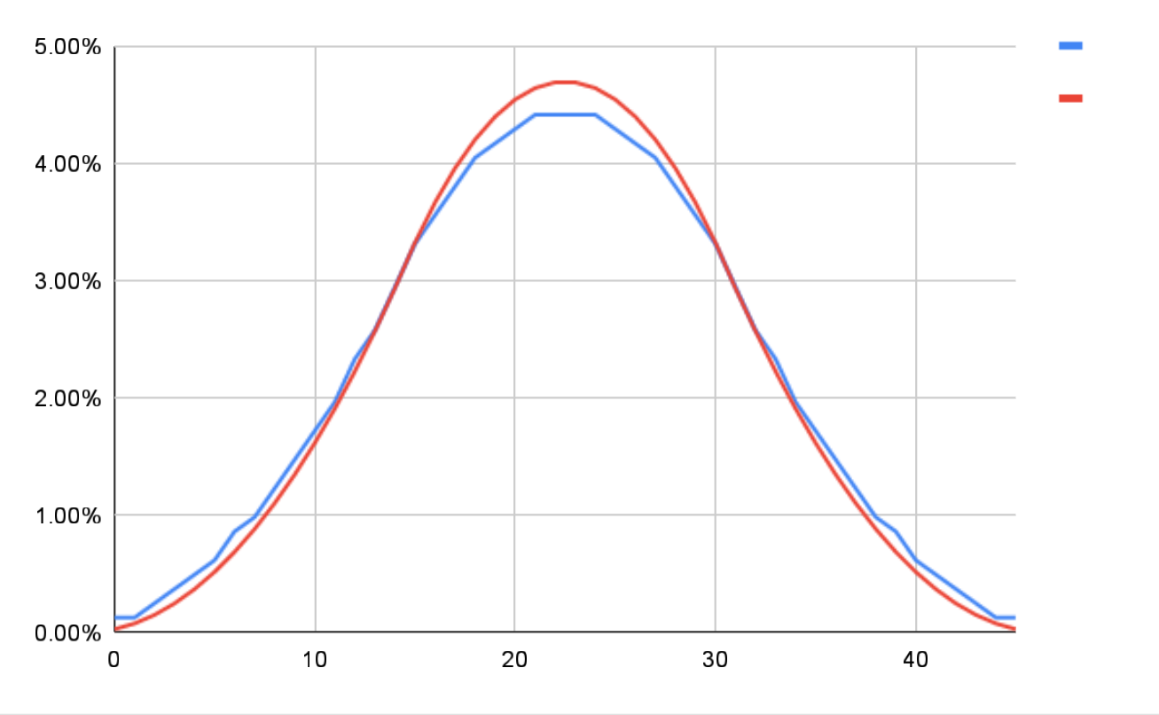
If IVs were generated completely randomly, then the top graph would show that the total amount of each IV would effectively be equal (thus a straight line across all values), while the bottom graph would look like a bell with the center around 22 or 23 (dead center in a range between 0 and 45); you can see an example of what it should look like below:
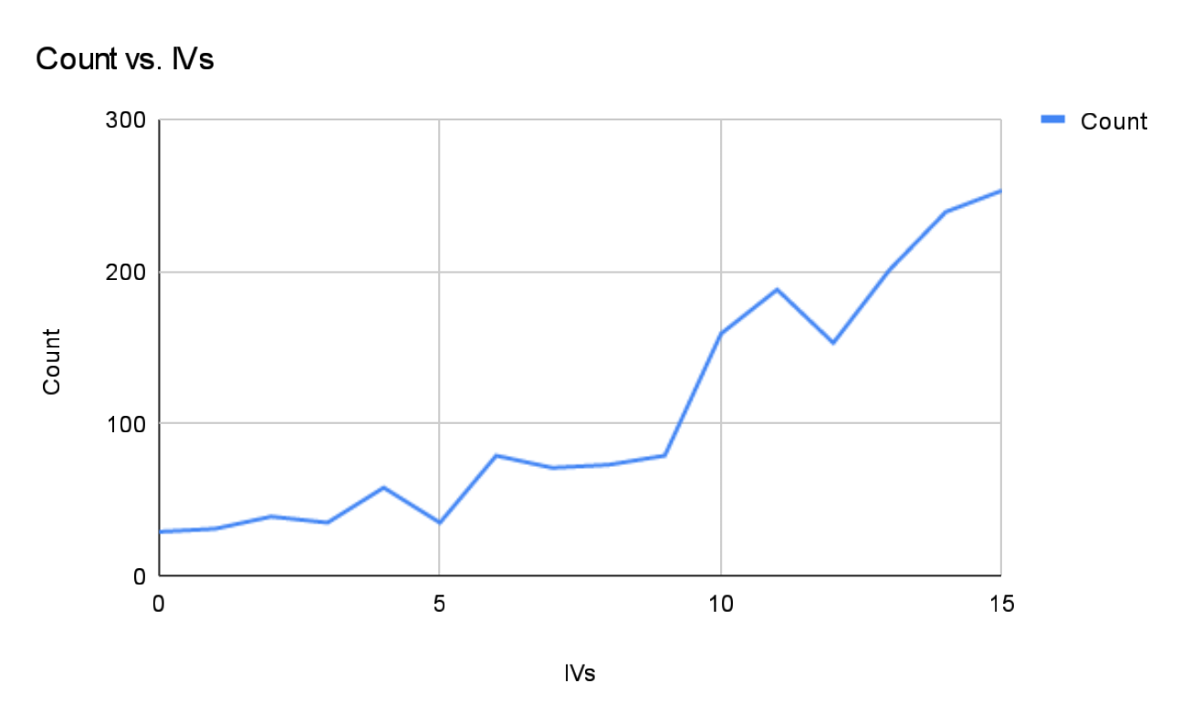
However, while that data is certainly closer to that ideal relative to my previous results (see below), it STILL shows a bias towards higher IV values. Specifically, the top graph shows that as the IV value increases, the chances that it appears also increases, while the bottom graph is already starting to look like a bell curve, but it’s centered closer to 28 than 22 or 23.

Now this review of the data is still at a preliminary stage. After all this only covers some 75 Pokémon, versus the something like 750 of the other graphs. But it’s interesting to see that there is always a clear pattern emerging from the data. I’ll still keep collecting data and processing them… maybe it’ll all even out, or maybe it’ll actually reinforce the hypothesis that the generated values ARE skewed towards better stats. Only time will tell!