
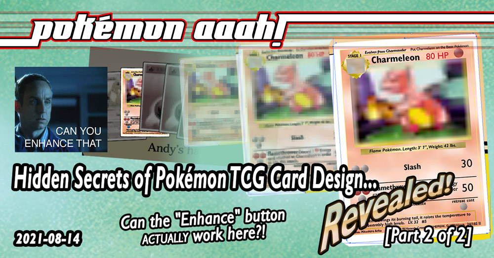
The Actual News:
So in my last post I talked about two different times when the various stewards of the Pokémon TCG had accidentally (or maybe “”accidentally””??) revealed how Pokémon TCG cards are designed. And in doing so it revealed a few other random secrets of the Pokémon TCG in general, as well as for anyone who is interested in actually making their own fake Pokémon TCG cards (like your’s truly).
But I also said it would be a two-parter, because this third story is pretty big. Like, seriously big. Not only did they basically give us a complete example of how a Pokémon TCG is designed and made, but it actually gives us like… a hundred other complete examples as well! …OK well, maybe not a literal hundred… maybe more closer to like… ninety-two examples. Still tho, this are some AWESOME discoveries that you’re not gonna wanna miss, and it even dovetails perfectly in the “Prototype Blastoise” story from a few months back. This is a Huzzah for all, and for all a good times! 
Classic PDF Files Reveal Insane TCG Secrets!
I’ve talked a lot already about how cards are made… but let’s use these techniques to do really naughty things that could get us into a lot of trouble: let’s break into Wizards’ original card blanks and see what real secrets are inside! Wait, huh? What am I talking about here??
Let’s actually run backwards a bit here, and let me share with you a fairytale—a tale as old as time—about how graphic and document design works. [ahem]
…Gripping, wasn’t it? Well clearly this tale is told to every design student at every design course—including mine when I graduated San Francisco State University with my Technical and Professional Writing degree—because there isn’t a single electronic document that doesn’t involve some kind of copy-and-pasted (or otherwise duplicated) element pulled from another document. Sorry if that ruined some of the magic of document design, but it’s true.
 But worry not, for this is actually a very good thing for our journey into Pokémon TCG card design. So back when the Pokémon TCG was first released outside of Japan by Wizards of the Coast (during their pre-Hasbro years even!), Wizards had to do more than simply make the cards for the game. They had to create tons of documents: instruction manuals, product guides, advertisement for the game, articles for players to learn how the game is played… all that jazz. And in order to populate the document with graphics showing stuff like player’s hands, cards in play, or other in-game elements, all they had to do was simply take existing card artwork and copy-and-paste them into their documents. Afterall, why reinvent the wheel? There are some 100-ish cards they can use in their documents right away. And that’s what they did, and Wizards of the Coast lived happily-ever-after.
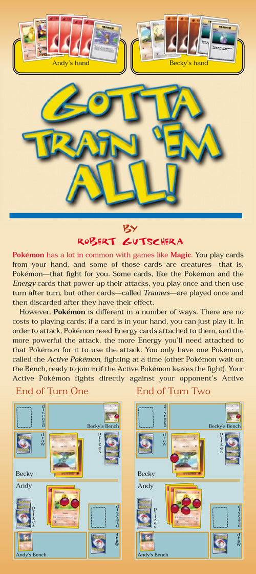
Now while in printed form—such as the excerpt on the right from an issue of The Duelist—the added graphics were a perfect representation of the card but also could never actually be used as an actual card (have you ever tried playing with a card cut out of a magazine??)… but as a PDF file, it was a slightly different story. This is because PDF files basically retains all the vector and raster data used to create the document, including any cards which were imported into the document to populate it with graphics. Case in point: the magazine excerpt on the right is part of a PDF file, which—when zoomed into the below picture—reveals which of the cards used on the page were simply raster exports of the cards, and which actually contain original card design data.

Now when you import the PDF into Photoshop, it simply rasterizes the PDF into a pixel image. But when you load the PDF into Adobe Illustrator, you can actually remove the elements of the page around to free it up. And when you do that…
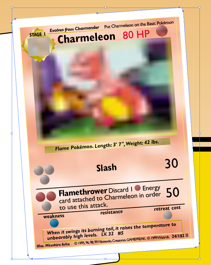
This, my friends, is an actual card document. Not a exported graphical version of it, not a custom imitation of a card made by the magazine’s layout artists… no, this is the real deal.
Well, basically. I mean, this is effectively the very same raw card document that some designer at Wizards created. It’s just that one copy of the card was sent to the printers to become the Shadowless Charmeleon card I have in my collection, while another copy was emailed to the Magazine Department to use in their articles about the game, which ended up here. So unfortunately it’s not like there was a Gigaleaks-tier hack of Nintendo’s graphic arts servers and I managed to get slipped a secret document of the pirated booty. But on the flip side, it’s not like this is some third-generation copy of the original, or even a first-generation. All the main vector and raster data that was used to make the card is still here. The problem is that PDF files like to keep their file sizes managable, so to do that all the raster graphics need to be reduced in size—both in pixel dimension and JPG quality. But the original vector data remains intact, and graphics data positions that WOULD have existed is still applicable: if I had the original card background, Charmeleon artwork and Energy symbols, and in their original graphic dimensions, I could just as easily drop them in there and I would have a copy of the card document that would be effectively indistinguisable from the original.
If you need any more proof, I’ll even line up a scan of my original Shadowless Charmeleon card and it should more-or-less line up. See?
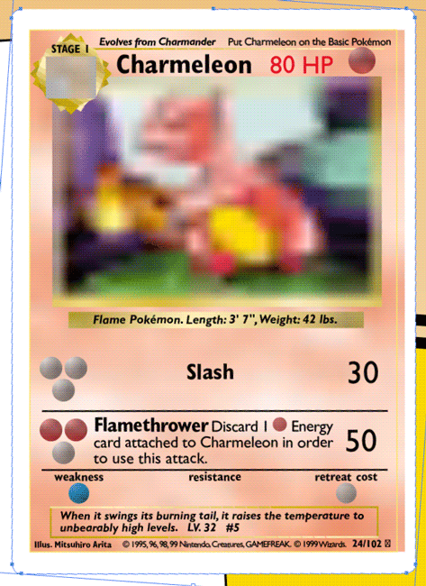
Wow, the actual card’s cut borders even lines up with the blue vector border! But it does look like a few bits and pixels are off… some of that I think can be chalked up to the printing and scanning process—effectively making it a second generation copy right off the bat—but some of it has to do with the fact that the original graphic was shrunk down, so some of the measurments might have gotten rounded down (more on that below). In any case, I’d still say that’s a lock in my book.
So yeah, big heckin’ deal here! In other words, yes, we’ve been able to effectively use the “Zoom In and Enhance Button” as seen on perfectly normal and totally authentic crime dramas. Fancy that!
OK, but… so what?
First off, that’s rude! Are you not entertained?
But secondly, there are some real world ramifications to the fact that basically the actual original card file exists in various old Pokémon TCG .PDF files and that we can unlock them all using Adobe Illustrator. Before I get too far ahead of myself, I do want to share with you some of the actual PDF files I’ll be working with. BTW, these were brought to my attention by PA! Discord user GC|Linkinboss, who really helped get this whole “Hidden Secrets!” article series off the ground! Anyways, check these out:
- Pojo.com’s Pokémon TCG Rules page — The Pojo was a major player back in the day, and I’m glad their website is still up! This page in particular has a lot of links to PDF files for the Pokémon TCG game, mostly rules, but other related documents as well.
- rulebook_swedish.pdf — this is a 12-page PDF copy of the Swedish-language version of the original Pokémon TCG rulebook. There’s nothing really special with it being the Swedish-language version, it just happens to be the one we’ll be working with.
- There are other language versions like Greek, Hebrew and Russian in that Pojo link above, which basically has all the same data and info as the Swedish PDF.
- duelist.pdf — Finally, this is a 19-page PDF copy of a collection of “Poké-Wisdom” from the various writers of The Duelist, which was a card game magazine created by Wizards of the Coast back in the day between 1994 and 1999. From 1999 to 2001 it was called TopDeck, before folding altogether. This PDF seems to simply be single articles from various issues of The Duelist, and was in turn included as part of either a download on Wizards’ website (www.wizards.com/pokemon) and/or as part of one of the many Pokémon TCG CD-ROMs that Wizards produced. Either way, the articles span a period between March and September 1999, meaning it covers only Base Set and Jungle. Wowzers!
- That said, GC|Linkinboss said they got it from Immewnity, so give Immewnity some extra heaping spoonfuls of thanks when you get a chance!
- That said, GC|Linkinboss said they got it from Immewnity, so give Immewnity some extra heaping spoonfuls of thanks when you get a chance!
Now that our base collection of PDFs is established, we can start exploring. The easiest thing we can do to start off our discovery expedition is to simply load up the file and start playing with various objects, just to see what has been locked away. Like, ever wanted to know what is behind a card image on a Pokémon and Trainer card? Is it simply a white square? Or does the Pokémon/Trainer background simply extend into the background? Well fortunately the Swedish Rulebook PDF can answer this one for us:
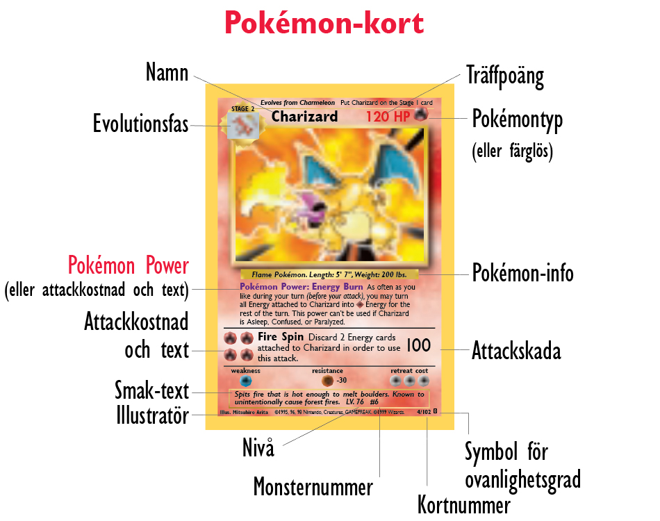
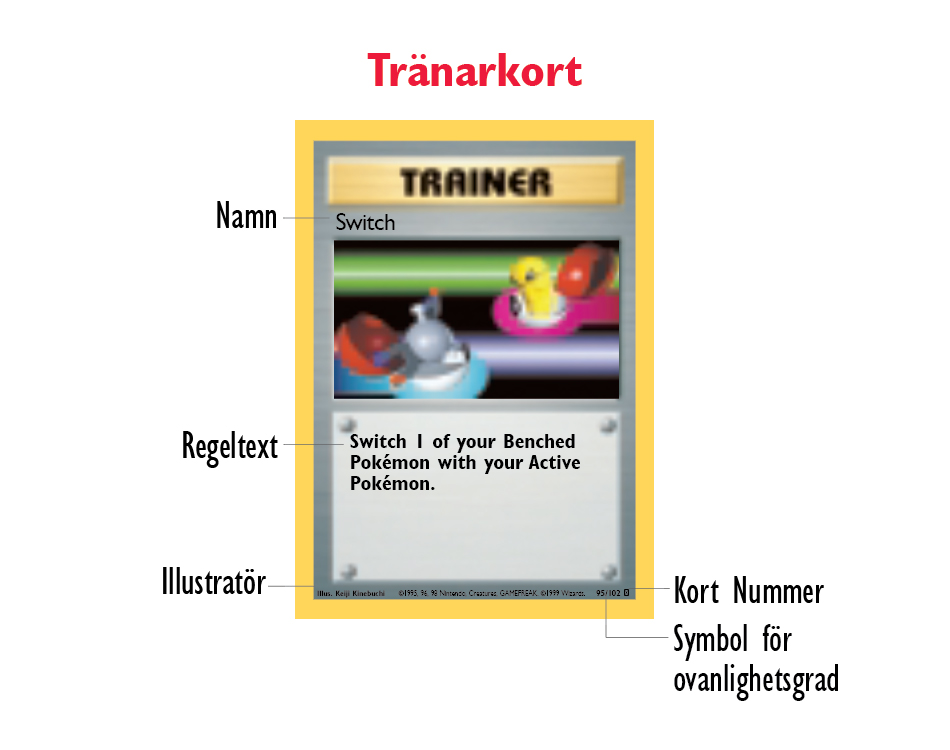
Here we have two perfectly normal Pokémon TCG cards, pulled straight from the Swedish Rulebook, albeit with the FPO text removed (which I think was a security feature). So what happens if we move the card art out of the way?
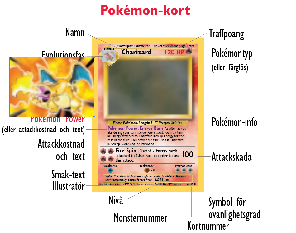
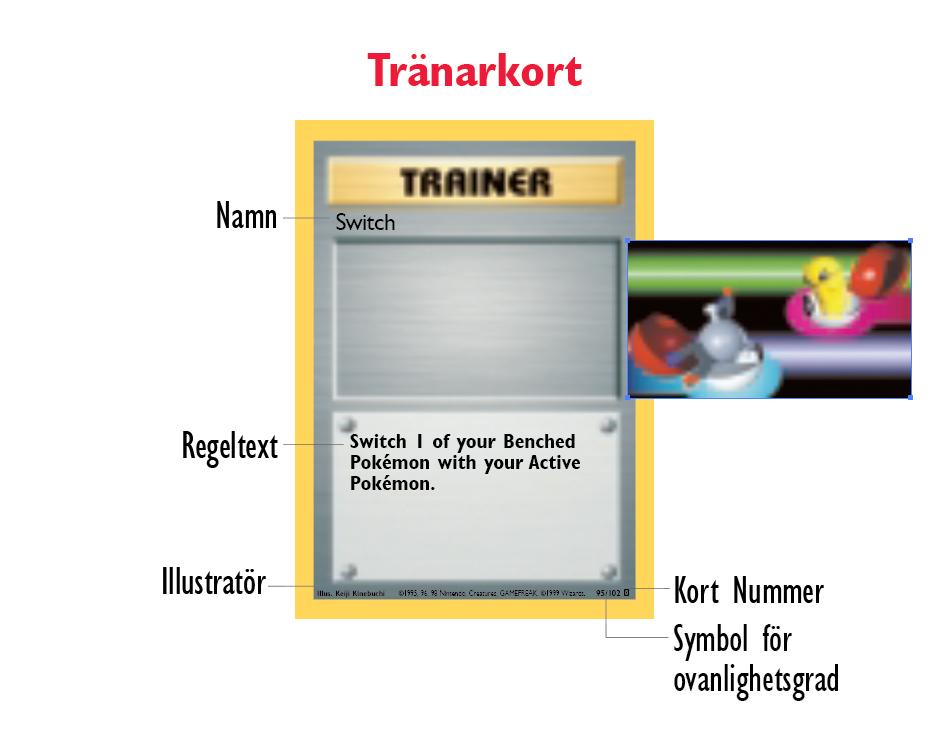
What the?! That’s right, the original card templates had a hidden background on them! We also get a glimpse at the small bit of Charizard’s picture that is hidden under the Evolution box (how ’bout that?). And before you think that maybe this was something unique to the instruction manual because those cards were some kind of custom design used by the rulebook makers… I found this same situation across multiple other documents as well, particularly in the various card file usage in The Duelest PDF file:

So yeah, we finally get to see what an original Pokémon TCG blank looks like… and it’s nothing like I expected it to be! It’s got a weird dark cloudy background for its art—except for Trainer cards, which just has more “Trainer Metal”—but it also have a weird thickened card art border. I was able to extract these blanks from the The Duelest PDF file; unfortunately these are the highest quality blanks for their respective types, and not all types were represented (missing Psychic and Colorless, and definitely Darkness and Metal as well).
But wait, why does that thickened border look familiar? That’s right: it’s the thick border originally used on the Prototype Blastoise card!
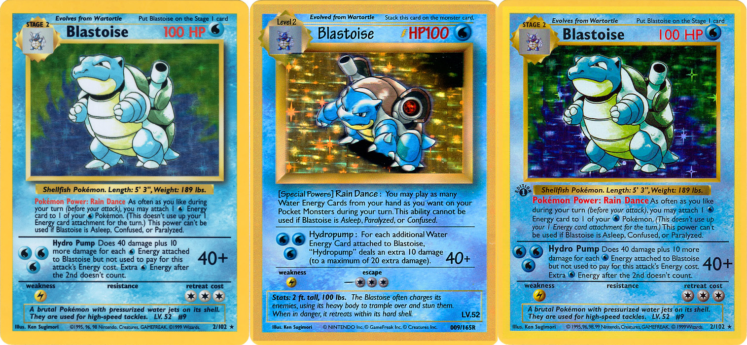
You read that right: the legacy of the original Prototype Blastoise lived on in literally EVERY SINGLE Pokémon TCG cards released between Unlimited Base Set (with the Shadow borders) until Neo Revelation… and only because Neo Destiny changed up the borders a bit (that’s a long story for another day). Aw Prototype Blastoise, you are the gift that keeps giving!
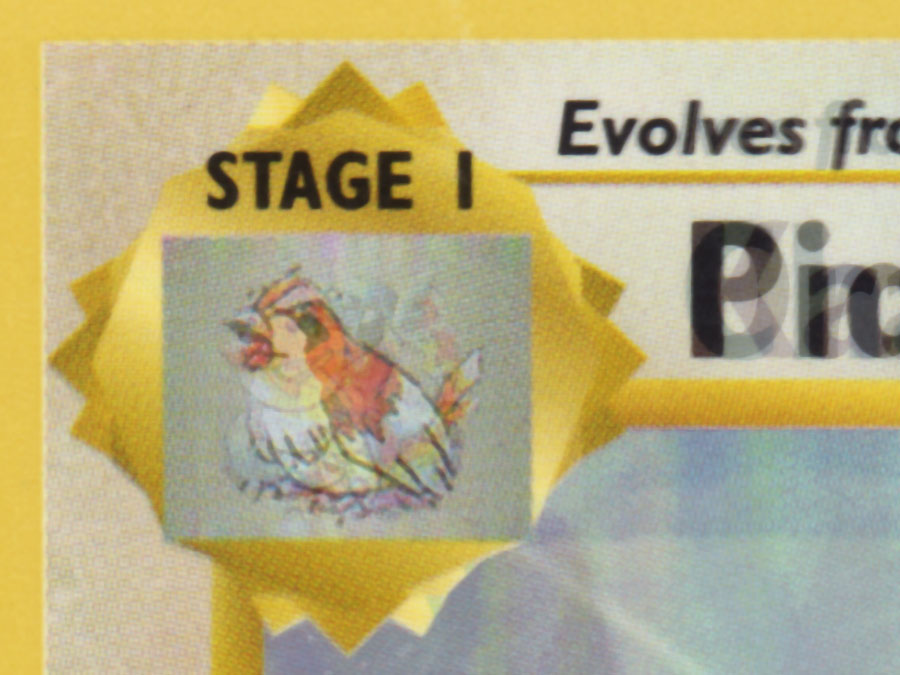
OK well, we’ve seen what the Unlimited card designs look like, are there any other card designs hidden away? Actually, there is: the 1st Edition Shadowless backgrounds! Those happened to also be mixed in with the Unlimited Shadow card designs, seeing as the The Duelest PDF covered the game from the beginning until just before the release of Fossil. Anyways, here’s the backgrounds:
Wha… what? No, surely I’m pulling your leg here! Clearly this is artwork made by the magazine staff. Maybe they had a magazine release deadline and couldn’t get in contact with any of the actual card designers, and therefore had to jerry-rig up a card design by simply copy-and-pasting the card’s field and doubling it up on the top half. Afterall, cards don’t look THAT bad, right??
I’m afraid that, yes, these ARE legit blanks. They really did double up the card art like that. This is why the 1st Edition Shadowless cards look so… let’s just say “unique” relative to every other card after it. I can at least prove that this is certainly real: my test Fighting Shadowless blank I made also has that “doubled up” look to it… which is honestly something I didn’t even notice myself until now:
So then I guess the question here is… why? Why did Wizards release a full set of cards using what are effectively their own blank style they made from scratch? Especially when the Prototype Blastoise seemed to have used a proper Shadowed Water template and not the Shadowless Water template that came after? I don’t know for sure, but my guess is that maybe they really did have a deadline issue and circumstances forced them to jerry-rig up a card design by simply copy-and-pasting the card’s field and doubling it up on the top half. Except this deadline was the actual proper release of 1st Edition Base Set, and maybe the circumstance was that perhaps the original graphic files of the card blanks Wizards was supposed to get from Nintendo/Media Factory got corrupted and they wouldn’t have been able to get backup artwork in time for release. Afterall, the internet wasn’t anything like it was today, and this was back before Wizards was purchased by Hasbro… so perhaps Wizards’ office at the time simply had no decent internet connection for them to simply redownload large, print-quality graphic files from all the way across the Pacific Ocean. So until Nintendo/Media Factory could Fed-Ex a fresh set of background graphics, Wizards’ graphic artists pulled a few all-nighters by basically making their own legal fake card blanks… albeit by simply scanning in the card fields and doubling them up for the top half… y’know, because no one’s gonna notice (and they were right!).
They should’ve gone with OCP Communications (the ONLY choice)!

I wish I could find out the actual story… but if this really was the case, well super-mega extra bonus kudos to the Wizards graphics staff for pulling this off. I’m sure they knew that no one would notice, and so they managed to save everyone’s butt in time for release.
So yeah, the raster graphics might have been slightly downgraded by the PDF file compression… but what about the vector artwork? Well fortunately that seems to have survived fairly unscathed.
Low-Quality Raster, but High-Quality Vectors & Data
The (re)discovery of all this original card design data is such a big deal for TCG fans and card fakers alike that would you be surprised if I told you that the low quality raster images is actually the worst news out of all this? So what’s the good news then? The fact that, as you saw with the Charmeleon card, basically all of the vector data remains basically as it originally was on the original card, and that other data also remains to be (re)discovered, giving us even more of a detailed look in how cards were (and are!) actually designed.
Now just as a reminder, 2D graphics can essentially be depicted in one of two ways: as a raster image or as a vector image.
- a raster image is a picture that builds its image using pixels, which are basically dot-by-dot constructions. Basically every computer screen and JPG photo is a raster image, and this format is perfect to pack in a lot of variety of colors and pixels. In fact, if you use Photoshop and you’ve seen the command “Rasterize Layer”, it means that it wants to convert text, vectors (like paths) or any other non-raster graphic into a raster graphic. Raster graphics are ideal if you want to be able to push a particular pixel of a particular color anywhere within its canvas.
- a vector image is a picture that builds its image using points and lines between those points. Technically the lines are called “edges” and points are called “vertices”, which is the source of its name. Vector images are great for drawing line art using simple flat colors, because vector images can be resized indefinitely and it’ll never lose any quality of resolution. The data itself is very efficient, meaning that a vector of a particular design will generally always be far smaller in file size than its rasterized equivilent.
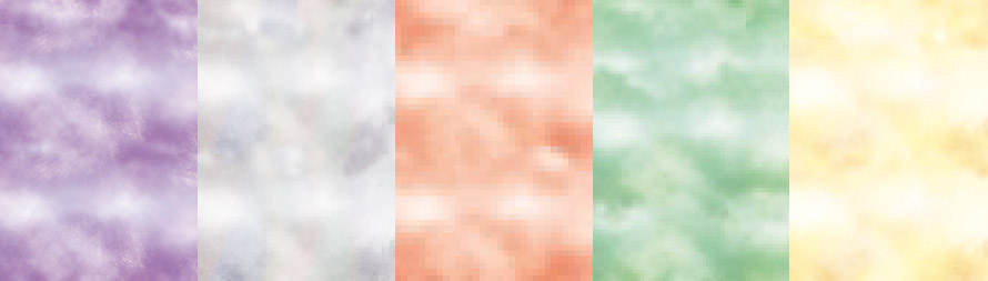
Perhaps a good way to better understand this is to look at these images; basically it shows the best and worse of what raster and vector graphics can do:
BEST RASTER: Perfect for photographs as you can pack in a bunch of individually colored pixels.

BEST VECTOR: Ideal for line art, as you can always have smooth lines no matter what size. And while you can’t set individual pixels to a specific color, you can still throw in gradients or other raster graphics to make the vector art feel lively. In fact, this is basically the fundamental principles for 3D-CGI polygons!

WORST VECTOR: Terrible for photgraphs, because it’s really difficult trying to draw all the various individual shapes needed for a particular color. And even then, it looks flat and can never capture the nuances of, say, a watercolor piece.

WORSE RASTER: Although you can technically rasterize a vector and it may still look fine… doing so locks in its detail at that particular size. That means you won’t be able to zoom in and get further detail like you can with a vector.
Pretty straight forward stuff, right? But at least you get an idea of what works and what doesn’t work. And especially why some artists use Adobe Photoshop (which focuses on raster graphics) and some use Adobe Illustrator (which is best for vector graphics)… and why document design apps like Adobe InDesign utilize both. But it’s the fact that a vector graphic can have a raster graphic inside it that is important in this part of our story.
Despite the fact that the raster graphics in the PDF were reduced in quality and dimensions, leaving us with a low-res muddy mess… the vector graphics essentially suffered no such reduction in quality. This means that the card layout and the dimensions of its vector graphics are as accurate as they were when they were originally designed. That’s why we were able to get such a high quality Charmeleon card—layout wise—despite the fact that it had been tilted and shrunk to be placed into Andy’s hand like that. Also too, this is a testament to the file size differences between raster and vector graphics.
So because of the fact that the vector graphics on the cards were not affected like the raster graphics were, we’re able to zoom into all the various cards and get detail which is crisper than any high resolution scan I can make. Here, take a look!
Both images are of the “Evolution Box” used during the Original Template designs.
On the left you can see a little example I quickly pulled together… and by “little example” I mean the five cards I scanned at the 1200 dpi scale I’ve been scanning cards at to make my high quality blanks with, while “quickly pulled together” means painstakenly overlaid those five example cards as best I could because no matter how large I scan them at the cards themselves were printed on a piece of paper about 2.5″ × 3.5″ (63.5mm × 88mm) which means their quality will always be inherently low.
Meanwhile on the right, I’ve got a quick screenshot of the evobox of the Charizard card used in the Swedish Rulebook. While the raster graphics didn’t fare very well, its vector graphics are just as crisp and emaculate as it was when it was originally designed. No matter how many cards I may scan, I will never get such clean and accurate lines as these are.
In fact, the vector artwork is SO clean, it actually solves a certain puzzle I’ve been struggling with to figure out until seeing this. Specifically, when I made blanks for the Original Card design and was trying to work out the actual design of the Evolution Box, I never could work out how exactly the grey evolution icon box fit inside the gold outline:
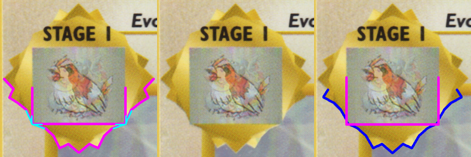
Like, did it touch the edges of the gold outline (like on the left), or maybe it extended beyond it ever so slightly (like on the right)? Unfortunately the card prints themselves weren’t of a high enough print resolution to determine, so no matter what I did, I never could get a straight answer. I mean, just look at the example scan as is (in the middle): can you tell yourself? But fortunately seeing the vector paths for the evolution box undeniably resolved this 20-plus mystery: the grey evolution icon box DOES extend beyond its gold frame! It’s VERY difficult to tell, but you can definitely tell in the vector outline animation above.
So neat! What other mysteries are lurking inside these vectors; I mentioned that they used raster art, what’s that all about? Well as you may have noticed above when I showed you the card templates as-is, the only item that’s truly “baked into” the card template was the super thicc art border. Everything else ended up being some kind of vector. This means the text, the Energy symbols, the Evolution boxes, all the bars and separators, and even the Pokémon Info Bar; they’re all some kind of added overlay.
The Evolution box, Info Text Bar and Pokédex Flavor Text Box also happen to include a raster graphic inside it. But while everything other than the Evolution box are just a simple rectangles, the vector shape of the Evolution box actually crops out parts of the raster image that’s used. Anyways, what do we get what we pull all those graphics out?


Neat! Alas this was the highest resolution I could pull—and even then I had to blend multiple small images to make the one on the left—but hopefully it still gives you a good idea of what’s going on. So remember in my previous post about how bleed works when cutting a card? Well the same situation is happening here: the vector lines mask out the bits that aren’t needed for the Evolution and the Flavor Text boxes, but their there are still graphics behind the cut just to make sure that the vector art remains crisp. Heck, even WITH the low-res raster graphics, the vector outline still managed to keep the gold bits cleanly separate from the Fire-type background.
But the best part about this is the fact that, if we somehow manage to acquire all the original raster graphics used on the cards… or heck, just make our own version of it, we can simply replace the low-res version with them and we’ll have our own card template that’s just as clean and accurate as the proper, real template that Wizards’ designers got to work with. This is gonna be sweet!

See, even Ol’ Granny here agrees with me! The things that this will set up for fake cards will kick ax!
Anyways, despite the fact that this post has gone on for quite a bit, I think it’s fair to say that I’ve really only just given you a quick overview of what’s out there.
…One More Thing!
 Even though I’ve covered everything that I wanted to cover concerning TCG card templates… the PDF files still have one little surprise for us. Well, maybe two.
The first one little surprise really isn’t anything too special… all this talk about vector graphics locked inside PDF files means that every PDF with a vector logo can be extracted into a high-res version of itself. Case in point, on that particular Pojo.com page of Pokémon PDFs, there are two covering the Aquapolis and Skyridge releases. While the PDFs themselves don’t exactly have any worthwhile info or graphics, it does have a copy of the Pokémon TCG logo used during the Card-E era… specifically, it had a giant “e☆” symbol in the middle of it representing its e-Reader compatability.
This logo would be the official Pokémon TCG logo between Aquapolis and EX Team Magma vs Team Aqua, when it reverted back to its normal logo with EX Hidden Legends. The TCG logo wouldn’t change until its current form (which is basically the same but with a more blocky, narrow text for “Trading Card Game”) until the release of Diamond & Pearl. In any case, this e-Reader logo isn’t seen all that much, and I think a lot of it has to do with the fact that there simply isn’t a decent version of it online anywhere. Well, here we are! Anyways, logo extraction is a bit of a low priority but the fact that we can dig through these old PDFs and extract missing logos is always a plus.
The other surprise is a legit surprise… it’s one last hidden piece of data that—if we were able to get it and dump it into our template—could also make card designs that much more authentic: the fonts! The thing is, when you load up any of the PDF files we found from Wizards into Adobe Illustrator, it gives us a tiny little warning about missing font files:
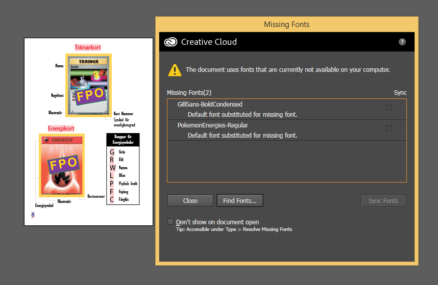
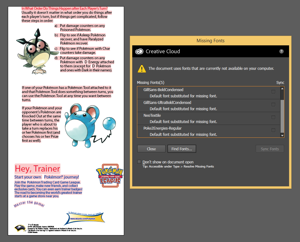
If you can’t read the text, Adobe Illustrator is basically telling us that because we’re missing a few fonts, it’s going to replace them with a default font. Some of the fonts we already know about—like Gill Sans Condensed Bold—so fixing that is a cinch. Similarly, “NeoTextile” is just another name for “Textile“, a font that was included on Apple Computers during the late-90’s. But these two screenshots are also letting us know about two font files we don’t actually have: PokemonEnergies-Regular and Poke2Energies-Regular. These are the exclusive font files used by Wizards (and most likely given to them by Nintendo) that they used to add as vector symbols for the energies. Specifically, PokemonEnergies-Regular was undoubtedly used for the original Energy symbols ( 


 ) while Poke2Energies-Regular surely adds Darkness (
  ) and Metal (
  ). You can at least see how they were used by looking at the left-image and seeing the letters G R W L P F C highlighted in pink; the pink is used by Illustrator to denote text with a disconnected font… if we had PokemonEnergies-Regular installed, it would show the symbols.
Now I guess we can use my Essentiarum and fill in the symbols themselves (G R W L P F C)… but I kinda want to get my hands on the ACTUAL PokemonEnergies-Regular and Poke2Energies-Regular font files. If anything I want to see if there are any other symbols that was added to those files. Wait… apparently you can extract TTF font files from PDFs?? Dang it, I wish I knew about this earlier… because—alas—I’ve run out of time!
Wawawiwah! What an amazing discovery this has been! Who would’ve thought that some old PDF files would so precisely preserve the actual card layout format for classic Pokémon TCG cards? To say nothing about all the other mysteries about them, like what’s behind the card art and why the 1st Edition Shadowless cards look the way they do. And then seeing it tie in with the Prototype Blastoise card like that?

But perhaps the best part about all this is… this is just the start! Who knows what other mysteries about the Pokémon TCG will be discovered when we take a deep dive into old documents like this? There’s a lot of PDFs that Wizards released that still need to be poured over… but at the very least we know what to be on the look out for. There may be some Card-E era card templates, or set logos, or other graphics and items just waiting to be rediscovered and extracted. I can’t wait to see what we’ll find next! …like maybe those Pokémon TCG Symbol font files?? Good times, good times….