
The Actual News:
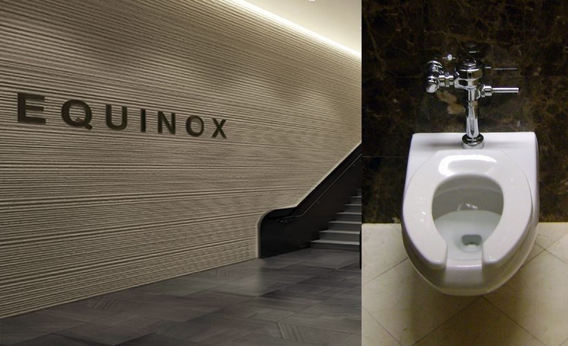
Ever since I got aschefield’s Sword & Shield blanks, I’ve been thinking about what I could do with them… and… well, I do have a plan for them, for sure. It won’t be anything from my Space World Block, but rather… I kinda wanna do some warm up stretches, y’know? I mean, no one starts a marathon without warming up, right? Well, what that plan is will be revealed tomorrow, but in the mean time, I thought I’d… uh… what’s a good exercize metaphor… OH! I thought I’d go to my local 24hr Fitness or Equinox and take a look at all the equipment and facilities! Y’know, where the water fountain is, where the bathroom is… y’know, the important things you need to know when you’re warming up to exercise.
The most important thing about exercise is knowing where you can disappear to in case you’re tired of exercising.
But seriously, I just wanted to get myself prepped before I get into the appetizers before I hit the main course. So I fired up my copy of Adobe InDesign, and I made THIS amazing paragon of Pokémon promotional art:
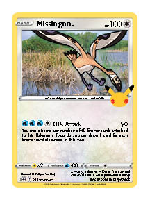
…I think something’s wrong here.
Oh wait, I forgot to export it using proper settings. Here, lemme fix that there…. ah, there we are:

The white border is a small consequence of using Adobe InDesign, but I’ll fix that later. But how’bout that?? It doesn’t look half bad!
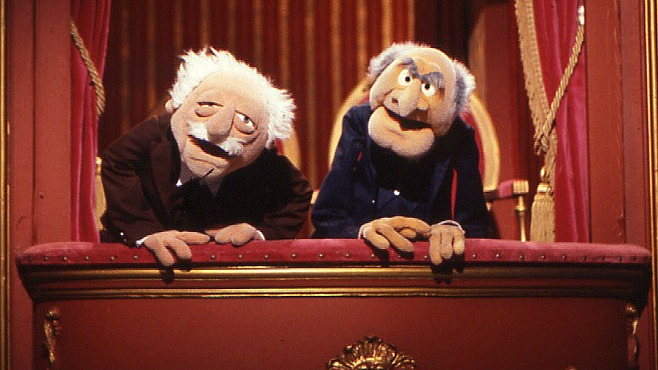
“No, it looks ALL bad! Oh hohohohoho!”
Aw but seriously, I really wasn’t trying to go for quality, I just wanted to get all the pieces together before I actually start thinking about quality. The thing is, unlike my previous faking efforts, this time I’m working in Adobe InDesign to create my fakes, and although I have plenty of experience with InDesign in general, this is quite literally the first time I designed a fake card using it. Designing fakes using it is quite a lot different than in Photoshop or even Illustrator, as the former focuses more on raster graphics while the latter utilizes vector graphics, but neither exactly uses both for the purpose of document design, which is what InDesign is for.

So I took some time today to lay out the basic outline of where the elements go, what fonts are used—which I only now just realized that modern cards also use Frutiger and Optima on top of Gill Sans and Futura—how to do the account for the white border around the Energy symbols… but I think I did a pretty good job of sussing things out. In fact, you can kinda see what I did in InDesign, where all the light-blue rectangle and ellipse frames are used as guides to help me line things up and/or set them up for later use.
But that’s really is for now, I just wanted to share with you this step I took and the first fake I’ve made in both InDesign and with aschefield’s SwSh blanks. Swing by tomorrow and I might actually have some fake cards to share with you. Huzzah! Good times.