The Actual News:
Hey! I’m not dead yet! Actually, not that I want to bore you with the details of my personal life, but I’m in the process of finding a new job… stuff like going over my resume, signing up for unemployment, and all that other “adulting” stuff that adults need to do… so updating the site might be a bit slow in the mean time. But it’s by no means dead! In fact, I’ve got a little “Plan for 2020 and Beyond” post brewing in the… brew-thingy, and so I’ll post it when it’s all done. In the mean time, why not swing by the PA! Discord server and chat with us there!
One little update I can share with you is this:

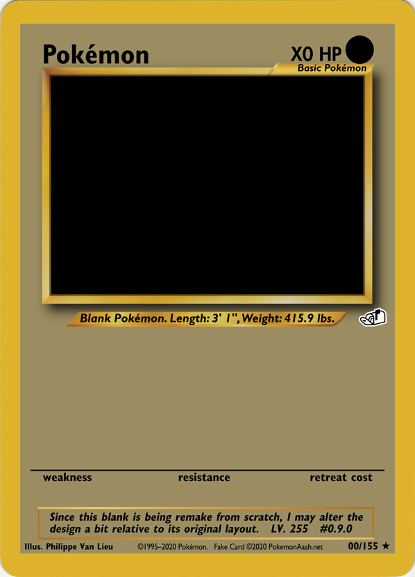
I’m still in the process of working on the “Neo Beta” blanks that I’ll be using for the “Space World ’97” Fake Cards that I’ll be working on soon. Neat, huh?
One thing I used to concern myself with when it came to making blanks was trying to make them as accurate and authentic as possible. The issue I’ve since realized with that is, because the blanks themselves had a number of variations between them, making a single blank which accurately portrayed them ALL would be somewhat impossible to do. So for these blanks, I’ve made the executive decision to stick with a specific layout design for the blank, even if it isn’t an accurate portrayal of those blanks… since there is not a SINGLE layout that could.
Some of these executive decisions include:
- the kerning used for the text
- I won’t get into the details, but whatever document design program Wizard of the Coasts used back in the late 90’s and early 00’s to design the cards with—most likely Aldus PageMaker, QuarkXPress, or Adobe InDesign—used a kerning system that isn’t accurately reproduced in modern versions of Adobe Photoshop. So I won’t bother trying to replicate it. Rather, I’ll just stick with the kerning system used in Photoshop (or any other document design app I happen to be using) and leave it at that.
- This will also include stuff like how the Pokémon’s Level and Number are spaced; on the actual cards, it’s some weird “two and a half” spaces width, but for my cards they’ll be two spaces and that’s it.
- the actual layout of the card and its elements
- a lot of the items aren’t exactly—or properly—centered onto the card… like, the flavor text rectangle wasn’t centered with the info bar, which wasn’t centered with the picture box, while none of those were centered in the main card layout, which in turn wasn’t centered with the actual card itself. While the latter can be excused due to the way the cards themselves are cut out from the main sheet of cards… it’s just pointless trying to accurately align each element when they weren’t aligned well to begin with. So, again, I’m just going to stick with my own system of alignment and leave it at that.
- the font sizes used for each text element
- it’s worth noting that the font sizes are definitely set at reasonable ratios with one another… like the Pokémon’s name is 150 px, the Illustrator text is 85, as is the info text, etc… it’s all some multiple of 5 or 10. Maybe only one or two elements are some fraction, but even then it’s 0.5 (one-half). That said, for anything that ISN’T of this reasonable ratio, I’m going to set it as such. I’m not going to bother trying to make the font sizes match PRECISELY what appears on the card, especially if that font size is something like 46.1295 px. Forget it; it’s going to be as close to some whole number multiple of 5 or 10 as possible, and that’s it.
- the copyright text will be of my own decision
- during the Neo-era of the TCG, the copyright text used was all over the place. Some included Wizards, some didn’t, some had the copyright go to 2000, others 2001, etc. Of course WHY it was either 2000 or 2001 makes sense for back then… but which one should I choose for today? Frankly, neither of them. Instead I’m just gonna stick with something like: “Design © 1995-2020 Pokémon. Fake Card © 2020 PokemonAaah.net“, partially to ensure that anyone using my blanks wouldn’t be able to make an “actual” card in order to scam others with, but also to let anyone else who sees the fake card know that they can find the rest at this site.
- Now what I’ll OFFICIALLY use is still up for debate… but it WILL be something that isn’t used on actual Neo cards, just cuz there isn’t ONE copyright notice which would be “most accurate” for those cards.
Anyways, that’s where I’m at with the blanks. I still have a ways to go, but at least this gives you an idea of what I’m planning for the blanks.
Got any other ideas or suggestions? Leave them in the comments below or let us know at the PA! Discord server! We’d love to hear from you! 
UPDATE:
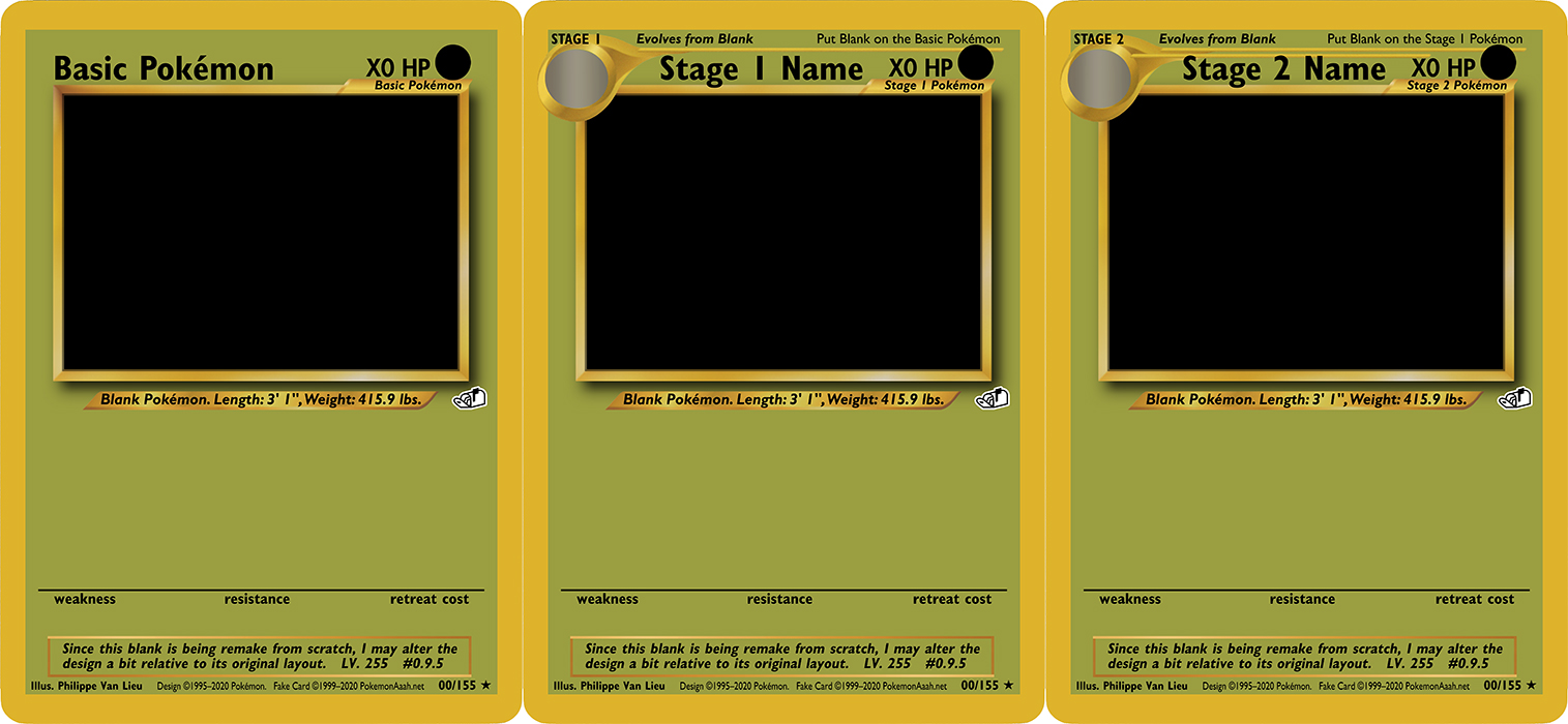
OK, I spent some time working on the layout for Stage 1 and Stage 2 Pokémon. Take a look!

Now I just need to work on all of the type stuff, so backgrounds, icons, and the little Nike/Newport swoops in the weakness and resistance section.
