The Actual News:
Heyo! It’s been a while since I last updated about the Galar Alphabet. Mostly because I have a big update due, and I’m piecing together a script for a video about it. But in the mean time, I have been writing down as many instances of Galarian text I can find, and I thought I’d do a new character frequency analysis.
But first, let’s cover some important prefaces:
- I updated the Galarian Word List page with a bunch of new words I found, some big, some small… but it was this update that prompted me to do this character frequency update.
- It goes without saying, but I still have a ways to go with getting this anywhere as complete as I’d like.
- One of the things I’ve also done is separate Galar characters between “uppercase” and “lowercase” forms, because it’s very clear that “lowercase” characters are used in specific instances, such as lists or menus, while normal signs and names use “uppercase” characters exclusively (or at least DON’T use “lowercase” characters).
- There is also clear patterns between different artists working with Galarian text. Some of them actually put effort into making words recognizable, or at least make it clear that the words they are creating are supposed to be something… while other artists just don’t give a crap and literally copy-and-paste letters to fill space.
- Maybe the best example of an artist that clearly didn’t care was the one who drew up the text for the red “Trainer Tips” sign: so much of it was copy-and-pasted, like how


 is used multiple times. There is ALSO a “new” character which places
  over
over  which is not used ANYWHERE else, but in turn is seen ONLY around the letters

 .
. - Incidentally, it’s for this reason that I think the artist who did the “Trainer Tips” sign was the same who did the “Rose Lift” text; I have pictures of this below.
- Maybe the best example of an artist that clearly didn’t care was the one who drew up the text for the red “Trainer Tips” sign: so much of it was copy-and-pasted, like how
- I had figured that different artists had different preferences, so I guess one thing I’ll need to do is figure out if I could even separate them out, or at least remove from any future analysis any pieces of text that are OBVIOUSLY made by those lazy artists. But then again, that means having to pick and choose, and… bleh. Whatever. None of this affects the following analysis, however.
Before I get to the graphs, lemme share the examples of the lazy artist and how they just duplicated their letters, even creating a “new letter” in the process.
 |
 |
OK at this point, this post needs to be put under a cut, so if you want to read more, just click below!
Here’s a zoom in into the important bits:

So I’ve shown other examples where the words are clearly supposed to be something. But here it’s clear that this particular artist just didn’t give a crap and just copied-and-pasted whatever text they wanted. You can also see why I thought that it was the same artist who did both the Trainer Tips sign and the lift outside of Rose’s office. In particular, the repeated segments include (or has most of):
- BLUE —


- CYAN —


 (includes that “new character”)
 - MAGENTA —


- GREEN —


Aaaaaanyways, finally we get to the important part of this post: the graphs. They are broken up into two formats: Relative and Actual. Also the numbers are somewhat skewed because I didn’t remove duplicates or other words that shouldn’t be counted. However, those instances are counted once or twice per character relative to the 60 or 70 total counted for that character, so the results wouldn’t be skewed that much. I do plan on doing a proper analysis later, tho.
First off are the Relative graphs. These set the most used and least used characters as 100% and 0%, respectively. The Galarian alphabet as a whole is in blue, while English is in Green. Galarian lowercase and uppercase character frequency is separate, in case those produce different results. Finally, all graphs are overlaid with one another to compare.
 |
 |
 |
 |
 |
|
As you can see, Galarian characters are used consistently more relative to one another, versus in English where a smaller group of letters are used way more often than others. I don’t think this explains much, other than perhaps characters are used more evenly than they are in English. But there’s more to this, which I’ll get to in a sec.
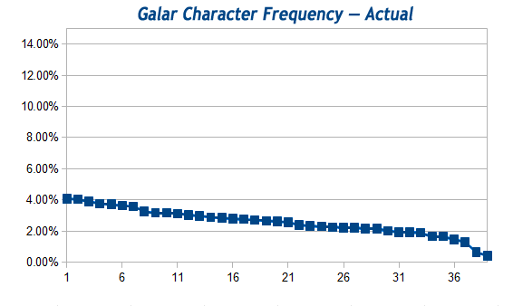
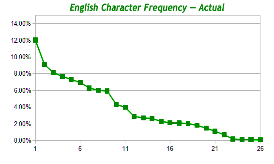
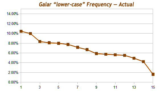
Next is a comparison of the actual frequency of each character, relative to the total number of characters used. This one produces a bit more precise results.
 |
 |
 |
 |
 |
|
Here you can see that, at least between both Galarian and English as a whole, Galarian is definitely used more evenly than English is. This definitely shows that its use is a lot more random than English. But the fact that it’s NOT a flat line shows that there is SOME syntax involved. In particular, look at how slanted the Galarian lowercase letters are relative to Galarian as a whole.
Now although this analysis was sort of informal, as it incorporated duplicated text and other extra bits which I should’ve removed, between these graphs and my observation above about how some artists didn’t give a crap… it leads me to conclude more strongly that there is definitely SOME intention involved, but it depended on the artist.
Therefore, while I will continue to write down as much Galarian as I can, I will also begin thinking of it in terms of whether it was intended to have meaning or not. That is to say, I expect intended Galarian text to have a frequency of characters similar to English while random Galarian text have an even frequency of characters. Of course, sorting out the two will be a challenge, but hey, I’m all about that challenge.
One other thing I’ve noticed is how the characters  and
and  are used almost hardly at all; you can see how much both drop off on the charts. I’m still including them, but I’m beginning to consider NOT including them in the charts. We’ll see.
And finally, for the record, here is the actual, raw data for the characters. Otherwise, that’s all I have to say about this for now. See you next time!
Just FYI, the list is sorted with the most used characters on top and descending to the least used. Here you can see where  and
and  aren’t used hardly at all.
You can also see why I don’t think the “new character”, namely  over
over  , would count as a proper new character; I’ve only seen that “new character” like four times, and most of them were on that “Trainer Tips” sign… and yet even the LEAST used characters are still used 3-4 times more than that “new character”. So, I think it’s just that lazy artist being lazy, or maybe inserting their own “signature”. Now I’ll keep an eye out for it, but that’s all I’ll do.
| LETTER | CHARACTER COUNT | LOWER CASE? | ALL CHARACTERS % | UPPER CASE % | LOWER CASE % |
| Total Character Count: | 2182 | 1330 | 852 | ||
 |
89 | L | 4.08% | 10.45% | |
 |
88 | 4.03% | 6.62% | ||
 |
85 | L | 3.90% | 9.98% | |
 |
82 | 3.76% | 6.17% | ||
 |
81 | 3.71% | 6.09% | ||
 |
79 | 3.62% | 5.94% | ||
 |
78 | 3.57% | 5.86% | ||
 |
71 | L | 3.25% | 8.33% | |
 |
69 | 3.16% | 5.19% | ||
 |
69 | L | 3.16% | 8.10% | |
| :G! | 68 | L | 3.12% | 7.98% | |
 |
66 | L | 3.02% | 7.75% | |
 |
65 | 2.98% | 4.89% | ||
 |
63 | 2.89% | 4.74% | ||
 |
62 | 2.84% | 4.66% | ||
 |
61 | L | 2.80% | 7.16% | |
 |
60 | 2.75% | 4.51% | ||
 |
59 | 2.70% | 4.44% | ||
 |
58 | 2.66% | 4.36% | ||
 |
57 | L | 2.61% | 6.69% | |
 |
56 | 2.57% | 4.21% | ||
 |
52 | 2.38% | 3.91% | ||
 |
51 | 2.34% | 3.83% | ||
 |
50 | L | 2.29% | 5.87% | |
 |
49 | L | 2.25% | 5.75% | |
 |
48 | L | 2.20% | 5.63% | |
 |
48 | 2.20% | 3.61% | ||
 |
47 | 2.15% | 3.53% | ||
 |
47 | L | 2.15% | 5.52% | |
 |
44 | 2.02% | 3.31% | ||
 |
42 | 1.92% | 3.16% | ||
 |
42 | L | 1.92% | 4.93% | |
 |
41 | 1.88% | 3.08% | ||
 |
36 | 1.65% | 2.71% | ||
 |
36 | L | 1.65% | 4.23% | |
 |
32 | 1.47% | 2.41% | ||
 |
28 | 1.28% | 2.11% | ||
 |
14 | L | 0.64% | 1.64% | |
 |
9 | 0.41% | 0.68% | ||
…
Oh man, you’ve made it this far? You’re AWESOME! Thanks for your time, it’s greatly appreciated!
