
The Actual News:
When it comes to making fake Pokémon TCG cards, I’ve learned that there are two main design goals that pretty much every faker aims for:
- authenticity of look and feel — trying to design a fake card which is nearly indistinguishable from the real thing
- pushing the envelope — breaking the rules and remixing standards… pulling off the craziest ideas, just to see what happens
In both cases, however, it’s about creating something you wish you could see happen in the game itself. But the thing is, most of the time we fakers have to do things on our own because… well, it’s not like TPCI and its franchisees will ever give us the tools we need to make the cards we want, right? … Well, what if they manage to accidentally reveal those tools to us in plain sight?
Today’s post is part one of two posts, covering the three times that the various stewards of the Pokémon TCG have maybe accidentally (or “”accidentally””??) revealed those inner secrets to us. And this is more than just for TCG fakers, but for all fans of the Pokémon TCG, as you’ll get a behind-the-scenes look at how cards are made. Good times!
Professional Reveals the Elements of Design
So a couple weeks back on the PA! Discord, I was sharing some insights on how I’ll be using Adobe InDesign to design some fake cards… and it reminded PA! Discord user and part-time battery resizer Immewnity of how they found some interesting pictures of card design on a TPCi graphic designer’s portfolio. Unfortunately Immewnity didn’t remember exactly who or where they got it from, and Google Image Search provides me with nothing… so all we’re left are the images themselves and the clues that may give us concerning actual card design. Take a look!
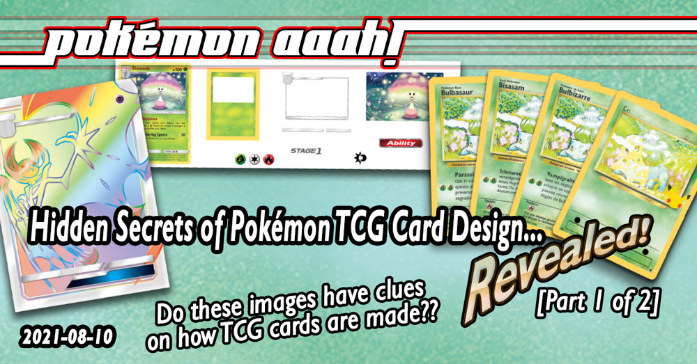
First off, this is a breakdown of Sun/Moon Shiinotic (#17), as designed by our Anonymous TPCi graphic designer. Here you can see every graphical element used on the card:
- You can see the Grass-type background, which is clearly devoid of anything, as basically everything else exists to be placed over it. All except the picture, which is most likely placed behind the Grass-type background graphic, assuming that the white-rectangle for the card art is actually transparent. The idea is that, no matter how big or small the actual artwork is, it’ll always fit within the card window.
- Incidentally, the yellow-colored borders are clearly much thicker than normal; this is the bleed, which is a common practice used in all kinds of printing. The idea is that, without the bleed, the printers/cutters will need to be concerned about where they need to cut the card… maybe they’ll cut too little of the card and maybe the border won’t be thick enough? But with the bleed, they’ll never have to worry about WHERE the card itself is cut, as it’ll always be cut with a yellow border.
- Speaking of the card art, that’s all the way on right. You can see what I mean about how no matter how big the card art actually is, it’ll always fit within the card art frame. It may be difficult to tell zoomed out, but you can see parts of the card art which is actually hidden behind the card art border. Just like with the bleed, it’s better to have more than not enough!
- Between the Grass-type background and the card art is the silver card art frame and Weakness/Resistance/Retreat boxes. Those are definitely transparent such that all the designer needs to do is place them over the card and it’ll always look fine.
- The “Stage 1” graphic is then placed within the appropriate box, as is the Morelull graphic which shows what Shiinotic evolved from.
- The Grass, Colorless and Fire Energy symbols below reveal that they only need those three graphics to fulfill all Energy Symbol requirements. Fundamentally they’re all the same size, but the document design program they use—most likely Adobe InDesign—can automatically resize them to fit whatever criteria they need it to fit. For example:
- The Grass symbol graphic can be used for both the card’s overall type as well as the attack’s energy cost.
- The Colorless symbol graphic is used for both the attack’s energy cost and its retreat.
- The Fire symbol graphic is used for Shiinotic’s weakness.
- The Sun/Moon set symbol most likely has a white circle around it which isn’t transparent, but it’s difficult (if at all possible) to see against the white background of the graphic. But that graphic would be placed in its respective location.
- Finally, the Ability graphic is placed in the respective location in Shiinotic’s game text.
Once all the graphic elements are placed, the rest of the card can be filled out… so the Pokémon’s name, HP, Evolution and Pokédex info, abilities and attacks, etc… those are all manually typed in. Incidentally, the LACK of a graphic for the rarity (and other symbols like the Grass-energy symbol in Shiinotic’s Illuminate ability) shows that those elements are actually bits of text from a specially created typeface… similar to my Elementiarum font which replaces letters of the alphabet with Pokémon type symbols.
But anyways, those are all the graphical elements used on a modern Pokémon TCG card! Pretty straight forward, huh? But at least it’s a nifty, informative window into how standard cards themselves are made. Especially considering how we used to—and still!—make blanks, where certain card elements are actually baked into the blank instead of it being a separate element. In fact, do keep in mind how these cards are made, because I’ll be showing you how this method of card designing has been pretty much the same since the beginning! … But we’re getting too ahead of ourselves. Onto the next portfolio piece from our mysterious TPCi designer!
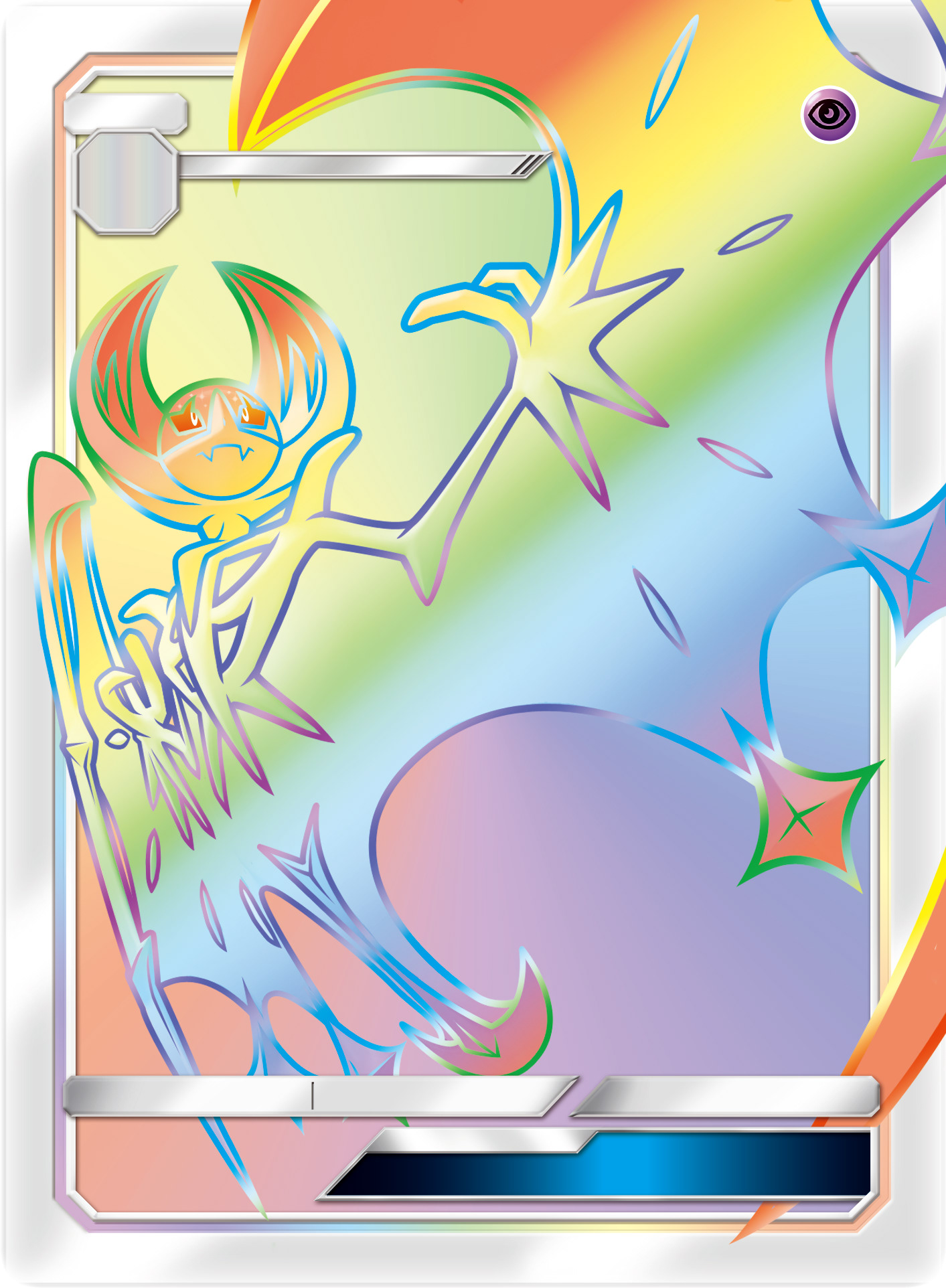
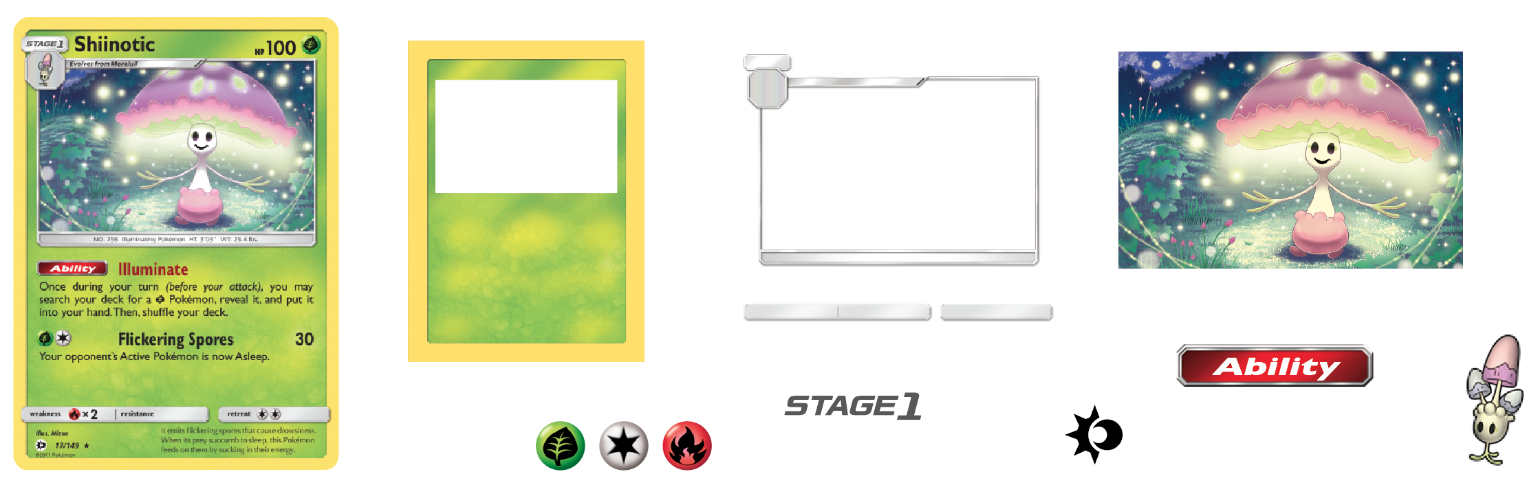
WOOOAAAHH… Look at that there Lunala-GX card! That thing is HUUUUUUGE! (It sure is, Tiny E!)
 Although the graphic elements have all been placed and positioned on the card, this card design still shows us two important aspects of card design:
- First off, you can once again see how bleed is utilized to make sure that the final cut card has artwork that extends to the border, no matter how the card is cut. Like, maybe the card will be cut too far to the left, or too far to the right… but no matter what, it’ll always have its art go to the border. This is such a standard concept in printing and design but it still goes a long away to making the final product look amazing.
- As a side note, I really love seeing all these details which are almost always hidden by the fact that the cards are cut down to size later on. You can see what was removed on the finalized card scan on the right, while below is a quick set of examples of different potential miscuts which show the reason why having a bleed is so important.
- Secondly, the card is lacking ALL bits of text. This helps ensure a standard look across multiple languages. That is to say, with this card’s main design set in stone, other designers working in other languages can take that graphic and overlay whatever language they want on it, and it’ll always look consistant. And if there’s one thing that keeps a product looking like it’s part of a worldwide-whole, it’s consistency!
As mentioned above, this is a quick set of example Lunala-GXs showing why having a bleed is super important, and how unless the miscut is INSANELY terrible, it’ll always show the full card.

Without these bleeds, the margin of error turns insanely tight, which makes printing even more difficult. But with these bleeds… well, of course miscuts are almost never done to the extreme of a 5° counter/anti-clockwise cut, but even then you’ll STILL be able to ensure that you’re getting 100% of a Lunala-GX card versus bits of another card. Work smarter, not harder!
Maybe the best part about this Lunala-GX card—at least when it comes to faking—is that, when it comes to creating an authentic fake card, we can get the most accurate and authentic colors for making our own kind of full-art GX card. I mean, yeah, I guess Pokémon TCG Online has screenshots of these cards too, but they’re so small and more compressed relative to this Lunala-GX card.
Oh! Speaking of Pokémon TCG Online… the cards used on it are almost certainly exports of the actual card documents used to make the actual Pokémon TCG cards. But truth be told, the cards on PTCGO themselves go through a bit of touchup before they finally appear in-game. If you want to get a good idea of what the cards might actually look like pulled straight from an export, take a look at this Dialga card from all the way back in the first Diamond & Pearl expansion!
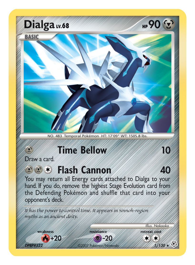
There is something unique-yet-common about this card: it reveals the 300 dpi printing size that pretty much every card is exported at… whether it’s being used for PTCGO or being sent to the printers. Here, you can see it better if I crop out the white bits and adjust the scaling so that it fits the approximately 63.5 × 88 mm dimensions of trading cards:
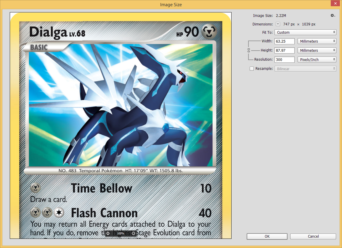
Yeah, so there we are! 300 dpi. In fact, this particular Dialga card is—as far as I’m aware—not a card on PTCGO, meaning that this was specifically intended for the printers. Anyways, as you can see with Dialga, 300 dpi or at least ~750 × 1050 px—give or take a few pixels—is the magic number on a number of cards. For example, that’s pretty much the pixel dimensions on every Pokémon TCG Online card, as well as the working dimensions of the First Partner Packs (although their jumbo size means they’re printed at about 140 dpi versus 300 dpi).
…
Unfortunately, those were the only pictures that Immewnity found and shared with us. I’ll bet you what most likely happened is that Nintendo sent that anonymous TPCi designer a friendly cease and desist letter to take those pictures down, but not before someone else downloaded them. Fortunately however they found their way here, and now we have a great peek into how these cards are actually designed! Maybe they’ll give you an idea of how to design your next fake card blanks??
International First Partner Packs Reveal Full Backgrounds!
We’re just about down to the last three generations of Starter Pokémon in the “First Partner Pack” initiative, and I’ve lucked out so far in being able to get every release thus far since March. The Hoenn Starters are due out any time now, so it’s time to pick up my water trumpet and sing the song of my Hoenn peeps!
But if you’re the faking (or lazy) type, then you might have been more impressed with the fact that Nintendo basically released clean pictures of ALL Starter Pokémon in a SUPER JUMBO form! Here, just click on these to see them all in SUPER JUMBO FORM:


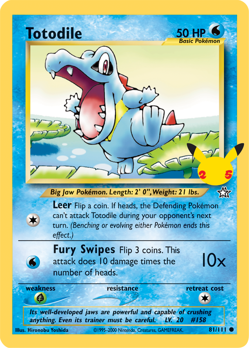
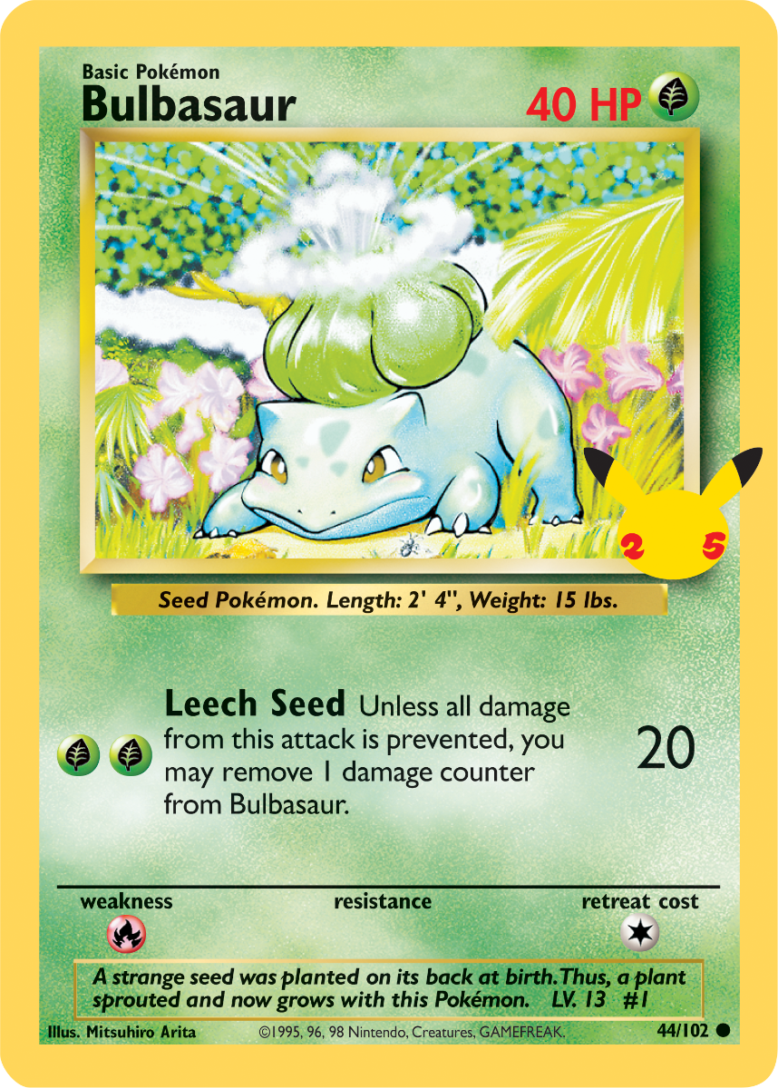


Pretty straight forward, right? But also old news, everyone knows this! Ah, but if you’re like me, then maybe you didn’t know that they also released versions of these cards in three other languages: German, French and Italian! (Sorry Spanish speakers, no love for you…) Take a look here at the foreign language Bulbasaur cards that Immewnity also shared with me:
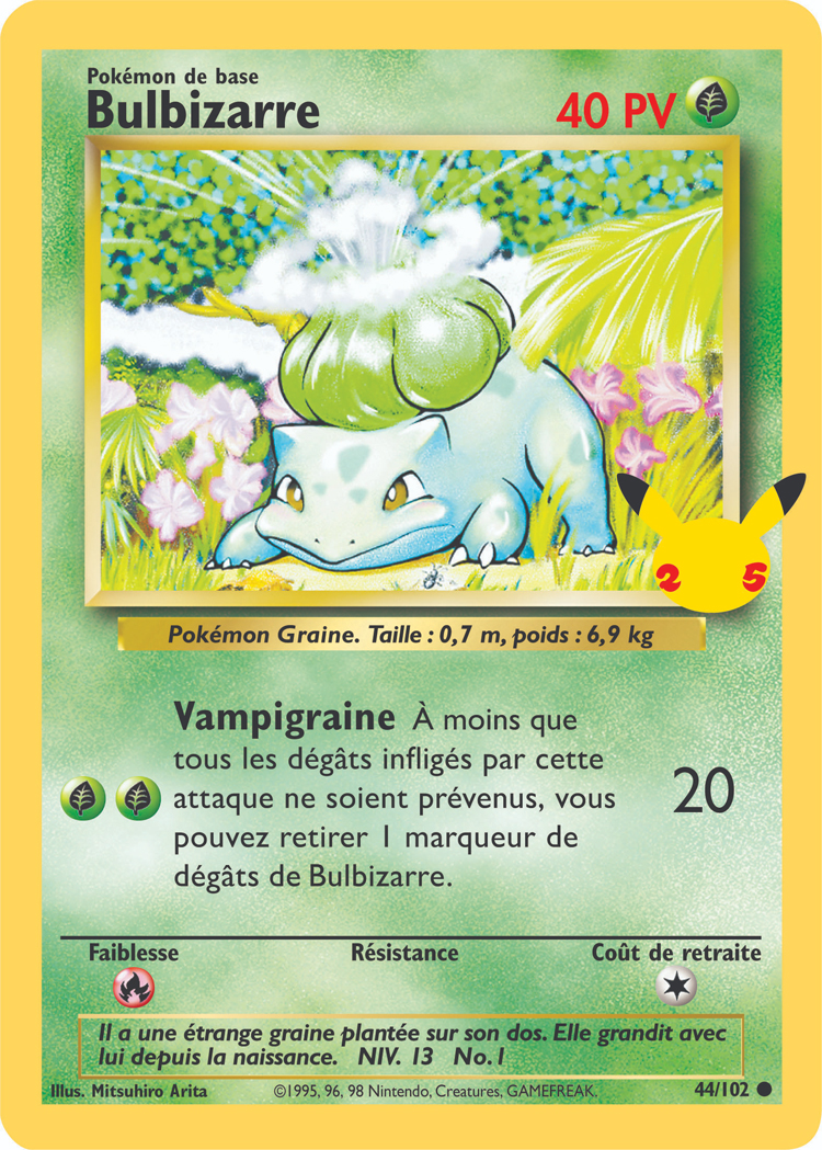


But again, so what, right? If you’re from Germany, France and/or Italy, you’ve known this for months now. But the real surprize didn’t come to me until I realized: these cards are all in different languages!
… wait wait don’t go! Sorry for being Mr. Obvious, but there’s a point to that. The thing is, because the card’s text are all in different languages, it means certain other parts of the cards reveal different other parts, meaning that it’ll actually be insanely easy to reveal the entire card’s background! In fact, if we mix the Bulbasaur and Chikorita cards in those four languages, we get basically a 99.9% clean blank. Take a look:
I mean, WOW. Yeah, there’s still a bit of guess work left, such as with the Weakness and Retreat Cost and the “Pokémon 25” logo… but still, there is a LOT removed from just mixing those cards together, and what’s left is damn near trivial to remove. And all because of minor things like “weakness” being either “Schwäche”, “Faiblesse” or “debolezza”; consider that if we only used one language, “weakness” would be “weakness” on every card blank, meaning it’s extremely difficult to try to replace it with an accurate background graphic if the same word is blotting out the exact same bits of background the exact same way every time.
The only sucky thing about this process is that I can only apply it on Grass, Fire, Water and Lightning Pokémon, since those are the only Original- and Neo-style cards which are part of the “First Partner Pack” release. But something is still better than nothing! Now even though I’ve got the Grass blanks worked out, I still need to download the foreign cards for Fire, Water and Lightning. Then once I’ve got enough of those cards worked out, I’ll be incorporating them into my Neo Redux blanks in some form. Thanks a bunch, TPCI! /srs
BONUS UPDATE: Neo Redux Layering!
This is a surprise minor side note, but the previous two entries really inspired me to do something new and amazing with my Neo Redux blanks. I hope you like them!
First off, because of the way cards are actually designed with layering upon layering of new elements… I’ve decided that I won’t exactly make a wide variety of blanks based on every single possible iteration, but instead I’ll be providing layers which you can add over existing blanks to transform them. This’ll either be in a single Photoshop or InDesign document which have those layers added in already, or as individual PNG files which you can download.
For example, take Trainer cards and the “Prism” type. Instead of having individual files for “Prism Items”, “Prism Supporters” and “Prism Stadiums”, as well as unique Trainer graphics for any other kind of Trainer type… what I’m gonna do is have a base, untouched Item, Supporter and Stadium blank, then have transparent overlays for “Prism”, or “Pokémon Tool” or any other card idea in mind. Take a look:
Here you can see the transparent Prism overlay and a perfectly normal Item Trainer blank. When you put one over the other, what do you get: a totally new blank!
Let’s give it another go with the Pokémon Tool overlay below: again, it’s the exact same Item Trainer blank, but with the Pokémon Tool overlay, suddenly it becomes a Pokémon Tool Item Trainer blank. And don’t worry, I’ll make sure that it’ll always align perfectly: all you’ll need to do is copy and paste the overlay—if not simply turning the layer on in Photoshop/InDesign—and it’ll always be a perfect fit.
Pretty sweet idea, huh? It’ll at least make faking a bit easier because now you won’t have to worry about trying to download the right blank… you can simply keep the blanks you already have and just download the appropriate overlay (assuming you haven’t done that already). This will also make my job in making blanks much easier because now I won’t have to worry about making tons upon tons of minor variations, or worse, decide that maybe a variation is NOT worth making only to find out that someone wanted to make a card using that variation.
But another important blank type that this opens up will be: international blanks! Instead of all my blanks being in English and you non-English players either having to blank out my blanks to add in your own language text… I’m just gonna make a set of blanks which are totally devoid of any words—so no “Basic Pokémon”, “Weakness”, etc etc—to then allow you to add in layers based on your own language. I did a test run earlier, making a Machop fake in German, French, Italian and Spanish, and I think it came out really nice. Check it out!

I kept the attack name the same across all languages because I’m lazy like that. But otherwise the cards are as authentic to their language’s card design… more or less. For example, Spanish’s HP text went from “PI” to “PV” to “PS”, so I’m sticking with “PS”. Also how “Level” is abbreviated in each language has changed since Neo, so I focused more on what modern sets have used.
But either way, the idea here is that I’ll be providing a COMPLETELY wordless blank as well as a Photoshop and/or InDesign document which has all important card text written in their appropriate language. Right now I’ve made those Machop fakes in those four languages, but I eventually plan on making other languages available, such as Dutch, Russian, Greek, and others! Er, of course, this’ll happen after I finish my Japanese Neo Redux blanks, as those are highest priority for me. But at least the idea of having layers like this allows me to make all kinds of blanks available to you, as well as allowing you to make the fake cards you wanted to make as simply and easily as possible. Huzzah!
Pretty neat stuff so far, huh?? I originally planned on this being a single post, but the last section turned out to be pretty large in-and-of-itself, so I decided to break it off into its own post, which I’ll be sharing soon!
So yeah, hopefully you’ve been getting a good idea of how Pokémon TCG cards are made, both in general but also in different languages as well. But what’s more interesting to me is that: my original method for making fake cards ever since day one was with Photoshop… but after discovering the ways that cards are actually designed, it has changed my perspective on card design in general. Specifically, three apps are used:
- Adobe Photoshop is used to create raster (pixel) art, such as the card type backgrounds, symbols, frames, etc
- Adobe Illustrator is used to create vector (line) art, such as the set logos and and card symbols like “1st Edition” and “Promo Star”
- Adobe InDesign is used to put them all together into a single document
Now it’s still perfectly OK to do all your fake card making with Adobe Photoshop alone, especially since Photoshop has many of the core tools that make Illustrator and InDesign necessary. In fact, those vector and document design tools within Photoshop is what kept me from using Illustrator and InDesign for so long! But as for now… knowing that the original graphic designers who physically created actual Pokémon TCG cards used these tools helps me feel closer and closer to that world. Understanding these tools better as well as seeing the ways that the cards themselves are broken down in order to be made almost feels like I’m seeing the very hands of the artists at work. Y’know, similar to how classical scientists like Isaac Newton wanted to study science and physics in order to understand the very nature and personality of God… afterall, if God made everything, then understanding how everything is made is to understand what God had in mind when He made it! …at least, that’s how the thinking goes. … Er, uhm… sla…. ANYWAYS… if knowing how these cards were actually made by the actual designers, it’ll certainly help me become a better artist as well; in fact, if what they’ve done is enough for them to make actual Pokémon TCG cards, then it should certainly be perfect for someone like me who wants to make fake Pokémon TCG cards, right??
Aw well, that’s enough philosophizin’ for now. Stick around for Part 2 when I’ll share with you how a random PDF document accidentally revealed some previously long-hidden secrets about the early years of the Pokémon TCG’s card designs, as well as linking Wizards of the Coast’s own Pokémon TCG designs with their original card design for their Prototype Blastoise! You’re not gonna want to miss that post, so keep your eye’s pealed! Good times!